


Introduction
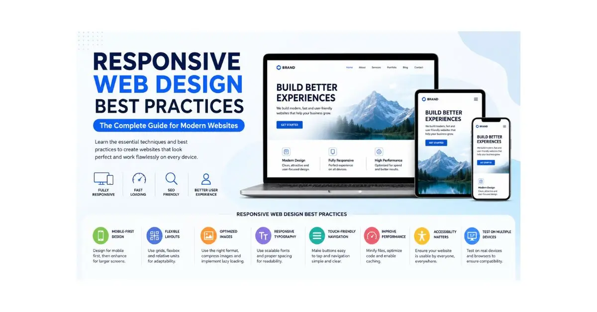
In today’s digital world, people access websites from smartphones, tablets, laptops, desktop computers, and even smart TVs. Because of this variety of devices, creating a website that looks and works perfectly on every screen has become more important than ever. This is where Responsive Web Design Best Practices play a crucial role.
A responsive website automatically adjusts its layout, images, text, and navigation according to the user’s screen size. Instead of building separate websites for desktop and mobile users, responsive web design ensures one website delivers an excellent experience everywhere.
Whether you are a beginner learning web development or an experienced designer looking to improve your projects, understanding responsive design is essential. It improves user satisfaction, boosts search engine rankings, increases conversions, and reduces website maintenance costs.
This guide covers everything you need to know about Responsive Web Design Best Practices, from understanding the fundamentals to implementing practical techniques that improve performance, usability, and accessibility. You’ll also discover common mistakes to avoid, expert recommendations, frequently asked questions, and actionable tips that can help you create websites that perform well on every device.
By following these proven best practices, you can build websites that are modern, efficient, and ready for the ever-changing digital landscape.
What is Responsive Web Design?
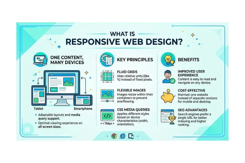
Responsive web design is a web development approach that allows a website to automatically adapt its appearance and functionality based on the screen size, orientation, and device being used.
Instead of creating separate desktop and mobile websites, developers build one flexible website that responds dynamically to different screen dimensions.
Responsive web design relies on three main components:
- Flexible layouts
- Flexible images and media
- CSS media queries
For example:
- A three-column desktop layout may become a single-column layout on a smartphone.
- Navigation menus may change into a mobile-friendly hamburger menu.
- Images automatically resize without losing quality.
The primary goal is to provide a seamless browsing experience regardless of the device visitors use.
Why is Responsive Web Design Important?
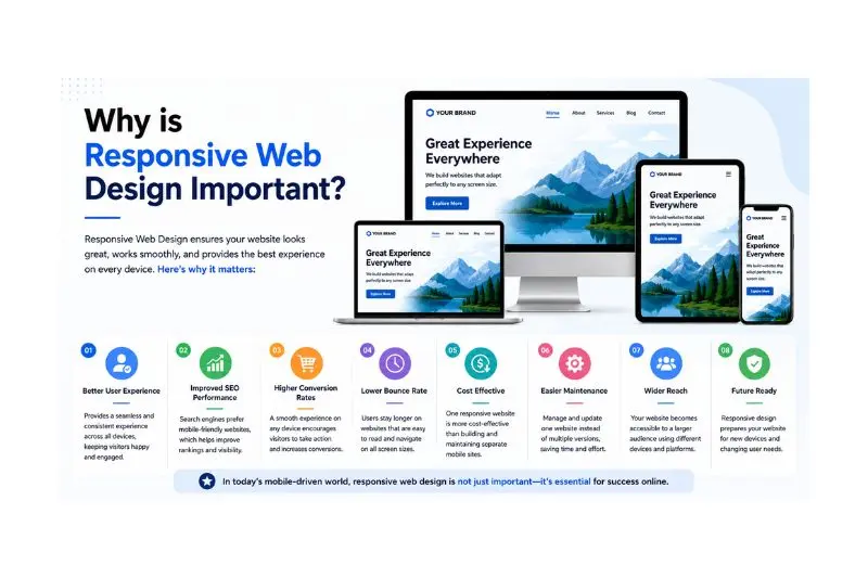
Responsive web design has become a standard requirement rather than an optional feature. Since mobile traffic now accounts for a significant portion of internet usage, businesses and developers must prioritize mobile-friendly websites.
Here are the major reasons why responsive web design matters:
Better User Experience
Visitors stay longer on websites that are easy to navigate and read on every device.
Improved SEO Performance
Search engines favor mobile-friendly websites, making responsive design beneficial for search rankings.
Higher Conversion Rates
A smooth browsing experience encourages users to complete purchases, fill out forms, or contact businesses.
Easier Website Maintenance
Managing one responsive website is far easier than maintaining separate desktop and mobile versions.
Faster Development
A single responsive design reduces development time and future updates.
Cost Effective
Businesses save money by maintaining one website instead of multiple versions.
Detailed Step-by-Step Guide
Step 1: Start with a Mobile-First Design
Mobile-first design means designing for small screens before expanding to larger ones.
Benefits include:
- Cleaner layouts
- Faster loading pages
- Better usability
- Improved scalability
Begin with the essential content and gradually add enhancements for larger devices.
Step 2: Use Flexible Grid Layouts
Avoid fixed-width layouts.
Instead, use:
- Percentages
- CSS Grid
- Flexbox
- Relative sizing
Flexible grids automatically adjust according to available screen space.
Example:
Instead of:
Width: 1200px
Use:
Width: 100%
This makes content adaptable across devices.
Step 3: Optimize Images
Large images slow websites considerably.
Best practices include:
- Compress images
- Use responsive image sizes
- Implement lazy loading
- Choose modern image formats
- Avoid oversized graphics
Optimized images improve loading speed without sacrificing quality.
Step 4: Use CSS Media Queries
Media queries allow websites to apply different styles depending on screen dimensions.
Examples include:
- Mobile phones
- Tablets
- Laptops
- Large desktop monitors
This ensures content remains readable and visually appealing.
Step 5: Build Flexible Typography
Text should remain comfortable to read on every screen.
Recommended practices:
- Use relative font units
- Maintain proper line spacing
- Avoid excessively small text
- Keep paragraph lengths manageable
Readable typography significantly improves user experience.
Step 6: Design Touch-Friendly Navigation
Desktop navigation often doesn’t work well on mobile devices.
Improve navigation by:
- Creating larger clickable buttons
- Adding enough spacing
- Using expandable menus
- Keeping navigation simple
Users should easily find important pages without zooming.
Step 7: Prioritize Website Speed
Fast websites improve user satisfaction and search rankings.
Ways to improve speed:
- Compress files
- Reduce unnecessary scripts
- Minify CSS and JavaScript
- Enable browser caching
- Optimize fonts
- Reduce server requests
Even a few seconds of delay can increase visitor abandonment.
Step 8: Test Across Multiple Devices
Never assume a website works everywhere.
Test on:
- Android phones
- iPhones
- Tablets
- Windows laptops
- Mac computers
- Different browsers
Testing reveals hidden layout issues before users encounter them.
Step 9: Improve Accessibility
Responsive design should also support users with disabilities.
Accessibility improvements include:
- Proper color contrast
- Keyboard navigation
- Alternative image text
- Clear headings
- Readable fonts
- Descriptive buttons
Accessible websites serve a broader audience.
Step 10: Keep Content Simple
Good responsive websites focus on content rather than unnecessary visual effects.
Organize information using:
- Clear headings
- Short paragraphs
- Bullet points
- White space
- Logical structure
Simple content is easier to read on small screens.
Benefits of Responsive Web Design Best Practices
Following responsive web design best practices offers numerous advantages:
- Improved user experience on all devices
- Better mobile usability
- Higher search engine rankings
- Faster loading websites
- Lower maintenance costs
- Increased customer satisfaction
- Better brand credibility
- Improved website accessibility
- Higher conversion rates
- Greater audience reach
- Easier future updates
- Consistent design across devices
- Reduced bounce rate
- Better engagement
- Enhanced website performance
Disadvantages / Risks
While responsive design provides many advantages, there are also some challenges.
- Initial development may take longer.
- Complex layouts require careful planning.
- Poor optimization can reduce performance.
- Large websites need extensive testing.
- Older browsers may have compatibility issues.
- Developers need knowledge of modern CSS techniques.
- Improper image optimization can slow mobile performance.
- Frequent testing is required as new devices enter the market.
Fortunately, these challenges are manageable with proper planning and regular maintenance.
Common Mistakes to Avoid
Many beginners make errors that reduce the effectiveness of responsive websites.
Avoid these common mistakes:
Ignoring Mobile Users
Designing only for desktop often creates frustrating mobile experiences.
Using Fixed Width Layouts
Fixed dimensions prevent websites from adapting to different screen sizes.
Oversized Images
Large images increase loading times dramatically.
Tiny Buttons
Small buttons are difficult to tap on touch devices.
Poor Font Choices
Unreadable fonts drive visitors away.
Skipping Device Testing
Always test on real devices whenever possible.
Too Many Popups
Excessive popups create a poor mobile experience.
Crowded Layouts
Give elements enough spacing to improve readability.
Ignoring Accessibility
Responsive websites should also be usable by everyone.
Overusing Animations
Heavy animations may reduce performance on lower-powered devices
FAQs
What is responsive web design?
Responsive web design is a method of building websites that automatically adapt to different screen sizes, ensuring a consistent experience across desktops, tablets, and smartphones.
Why is responsive web design important for SEO?
Search engines prioritize mobile-friendly websites because they provide a better user experience. Responsive websites also reduce duplicate content issues and improve usability, both of which can positively influence rankings.
Is responsive design better than a separate mobile website?
Yes. A responsive website is generally easier to maintain, more cost-effective, and offers a consistent experience across devices without requiring multiple versions of the same site.
Which CSS technologies are commonly used in responsive design?
Modern responsive websites commonly use:
CSS Grid
Flexbox
Media Queries
Relative units
Responsive images
These technologies help create flexible layouts.
How often should responsive websites be tested?
Testing should occur:
During development
Before launch
After major updates
When new devices become popular
After browser updates
Regular testing ensures ongoing compatibility.
Does responsive design improve website speed?
Responsive design itself doesn’t automatically make a website faster. However, following responsive web design best practices—such as optimizing images, reducing unnecessary code, and improving loading performance—can significantly increase speed.
Expert Tips & Bonus Points
Want to create truly professional responsive websites? Follow these expert recommendations:
- Design mobile-first from the beginning.
- Keep navigation simple and intuitive.
- Use whitespace generously.
- Optimize every image before uploading.
- Avoid unnecessary plugins.
- Compress CSS and JavaScript files.
- Use scalable vector graphics whenever possible.
- Maintain consistent branding across devices.
- Test in multiple browsers.
- Monitor website performance regularly.
- Focus on accessibility from day one.
- Keep page layouts clean and uncluttered.
- Use readable typography with proper spacing.
- Update responsive components as technology evolves.
- Always prioritize user experience over visual complexity.
A successful responsive website balances design, speed, usability, and accessibility while remaining easy to maintain.
Conclusion
Modern websites must serve users across an ever-growing range of devices, making Responsive Web Design Best Practices an essential part of web development. A responsive approach ensures that layouts, images, typography, and navigation automatically adapt to different screen sizes, providing visitors with a smooth and enjoyable experience regardless of how they access your site.
By implementing mobile-first design, flexible grids, responsive images, optimized performance, intuitive navigation, and accessibility features, you can create websites that are both visually appealing and highly functional. These practices not only improve usability but also support stronger search engine visibility, increased engagement, and higher conversion rates.
Although responsive design requires thoughtful planning, regular testing, and ongoing maintenance, the long-term benefits far outweigh the initial effort. Businesses save time and resources by managing a single website, while users enjoy consistent performance across smartphones, tablets, laptops, and desktop computers.
As web technologies continue to evolve, staying updated with responsive design techniques will help you build websites that remain effective, competitive, and user-friendly. Whether you’re creating your first website or refining an existing project, applying these best practices will help you deliver a fast, accessible, and professional online experience that meets the expectations of today’s digital audience.
